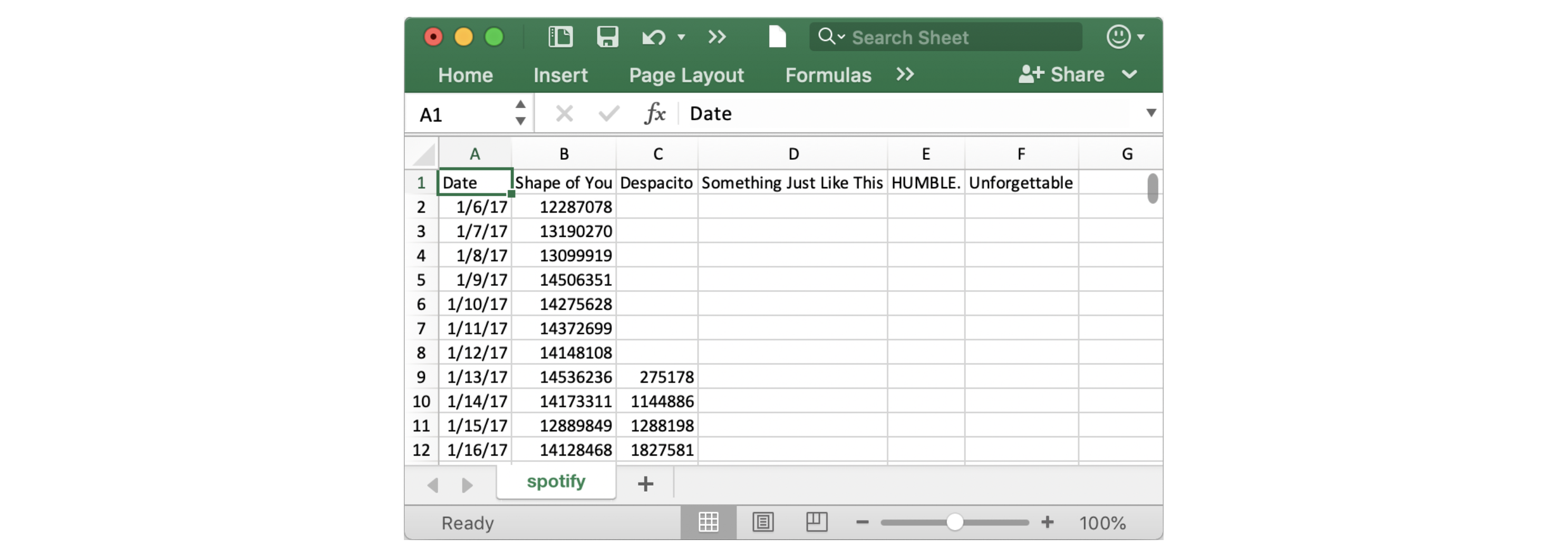
In this tutorial, you'll learn just enough Python to create professional looking line charts. Then, in the following exercise, you'll put your new skills to work with a real-world dataset.
We begin by setting up the coding environment.
import pandas as pd
pd.plotting.register_matplotlib_converters()
import matplotlib.pyplot as plt
%matplotlib inline
import seaborn as sns
print("Setup Complete")
The dataset for this tutorial tracks global daily streams on the music streaming service Spotify. We focus on five popular songs from 2017 and 2018:

Notice that the first date that appears is January 6, 2017, corresponding to the release date of "The Shape of You", by Ed Sheeran. And, using the table, you can see that "The Shape of You" was streamed 12,287,078 times globally on the day of its release. Notice that the other songs have missing values in the first row, because they weren't released until later!
As you learned in the previous tutorial, we load the dataset using the pd.read_csv command.
# Path of the file to read
spotify_filepath = "../input/spotify.csv"

# Read the file into a variable spotify_data
spotify_data = pd.read_csv(spotify_filepath, index_col="Date", parse_dates=True)
The end result of running both lines of code above is that we can now access the dataset by using spotify_data.
We can print the first five rows of the dataset by using the head command that you learned about in the previous tutorial.
# Print the first 5 rows of the data
spotify_data.head()